
Introduction: Why Color Psychology Matters More Than Ever
Colors are more than just visual aesthetics. They shape emotions, build memories, and influence buying decisions faster than text or typography ever can. Research shows that people form an opinion about a brand within 90 seconds, and up to 90% of that judgment is based on color alone.
This is why top brands like Netflix, Coca-Cola, Zomato, and Google invest heavily in color psychology to influence how people feel about their brand. As a professional branding agency or website design agency, understanding color behavior is essential to creating designs that are not only attractive but strategically aligned with emotions, conversions, and brand perception.
In this blog, we break down how color psychology works, how different colors influence buyer emotions, and how brands can use the right colors to boost sales — whether through branding, website design, social media marketing, digital marketing, packaging, or advertising.
1. What Is Color Psychology — And Why It Shapes Brand Success
Color psychology is the study of how different colors evoke emotional and psychological responses. It impacts how consumers:
-
Perceive your brand personality
-
Decide whether they trust you
-
Feel about your products
-
Take action — like clicking, purchasing, or subscribing
For example:
-
Blue builds trust → often used by finance and tech brands
-
Red triggers urgency and appetite → used by food and retail brands
-
Purple symbolizes luxury and creativity → used by premium brands
-
Green suggests freshness and sustainability → used by eco and wellness brands
In branding and advertising, color acts as the first communication tool — even before your logo, slogan, or message.
2. The Science Behind How Color Affects Emotions & Buying Decisions
Colors influence the limbic system, the part of the brain responsible for emotions and memory. This is why:
- Red feels energetic
- Blue feels safe
- Yellow feels cheerful
- Black feels premium
Studies also show:
-
93% of consumers say visual appearance is the top factor in deciding whether to buy
-
Color increases brand recognition by up to 80%
-
Conversion rates can increase by 35% through optimized color usage in CTAs, ads, and websites
For a website design agency, choosing the right color palette can improve:
-
Click-through rates
-
Time spent on website
-
Trust signals
-
Lead generation
-
Sales conversions
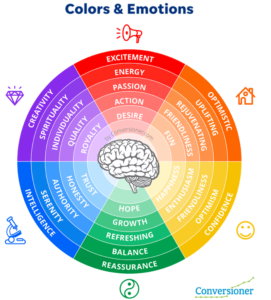
3. What Different Colors Mean in Branding
Below are the most widely used colors and the psychology behind each — with examples and usage scenarios.
Red — Power, Energy, Appetite
Red is the most emotionally intense color. It increases heart rate, boosts energy, and creates urgency.
Used by: Coca-Cola, Zomato, Netflix, Target
Best for:
-
Food and restaurants
-
E-commerce
-
Sales ads
-
Call-to-action buttons
-
Fast decision-making industries
When to use:
If your digital marketing, social media marketing, or advertising campaign needs high engagement, red helps drive instant action.
Blue — Trust, Stability, Professionalism
Blue is calming and trustworthy — the most used color by global corporate brands.
Used by: Facebook, LinkedIn, PayPal, American Express
Best for:
-
Finance
-
IT companies
-
Website design agencies
-
Hospitals
-
B2B brands
When to use:
If your brand needs to communicate reliability and security.
Black — Luxury, Power, Exclusivity
Black is elegant, bold, and premium.
Used by: Apple, Chanel, Nike, Tesla
Best for:
-
Luxury products
-
Professional agencies
-
Fashion brands
-
Premium technology
When to use:
If you want a high-end, sophisticated brand image.
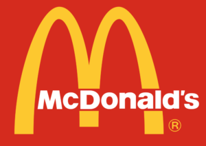
Yellow — Optimism, Creativity, Happiness
Yellow is lively and attention-grabbing.
Used by: McDonald’s, Snapdeal, DHL
Best for:
-
Youth-centric brands
-
Creative agencies
-
Startups
-
Kids’ products
When to use:
If your branding or website design needs to look energetic, friendly, and approachable.
Green — Growth, Nature, Health
Green symbolizes balance, renewal, and eco-consciousness.
Used by: Starbucks, Whole Foods, Spotify
Best for:
-
Health & wellness
-
Organic brands
-
Eco-friendly companies
-
Finance (growth symbolism)
When to use:
If your brand focuses on sustainability, health, or growth.
Purple — Royalty, Luxury, Imagination
Purple blends red’s energy and blue’s calmness.
Used by: Cadbury, Hallmark, Yahoo
Best for:
-
Luxury goods
-
Beauty brands
-
Creative industries
-
High-end services
When to use:
If you want to portray creativity with sophistication.
Orange — Confidence, Cheer, Affordability
Orange is energetic and friendly but less intense than red.
Used by: Amazon, Fanta, Nickelodeon
Best for:
-
Entertainment
-
Youth brands
-
E-commerce
-
Marketing agencies
When to use:
If you want a fun, youthful, modern brand personality.
4. How Color Psychology Influences Website Design & Conversions
Color psychology plays one of the most strategic roles in modern website design, especially when the goal is to guide users toward action. Your website is not only a digital storefront — it’s one of the first places where customers subconsciously judge your brand. The right color palette can improve trust, clarity, navigation, and conversion rates, while the wrong palette can increase bounce rates and create decision fatigue.
For example, high-contrast colors improve readability and user flow. This is why CTAs often use bold accents like red, orange, or green — they attract attention instantly. Similarly, neutral backgrounds (white, cream, black, grey) create a calming environment that encourages users to explore more pages.
Colors also carry emotional meaning. A blue-based website design conveys trust (ideal for finance, agencies, IT), while yellow accents add energy (perfect for e-commerce and youth brands). Brands that combine color psychology with UX principles tend to see higher engagement, longer session durations, and improved conversions.
5. How Brands Use Color Psychology Successfully
Color psychology becomes more powerful when we observe how global and Indian brands use it consistently. For instance, McDonald’s uses red and yellow for hunger stimulation and happiness — making it one of the most recognizable brands worldwide. Similarly, Starbucks’ green reflects calmness and sustainability, instantly aligning with its “relax and enjoy your moment” brand message.
Luxury brands like Chanel, Rolex, Prada, and Apple rely on black and white palettes to communicate exclusivity, minimalism, and premium craftsmanship. On the other hand, platforms like Spotify (green) and Instagram (multicolor gradient) use vibrant hues to connect with millennials and Gen Z—audiences that prefer expressive and bold brand personalities.
Brands also combine color psychology with AI-powered marketing to understand customer behavior more deeply. According to research published by Google Search Central, AI systems can analyze how users respond to different colors on ads and websites, making it possible to optimize visual design for real-time engagement.
6. How a Branding Agency Should Choose Colors Strategically
Choosing brand colors is not a creative guesswork process — it’s a strategic exercise built on psychology, research, and market behavior. A professional branding agency starts by understanding your brand personality: Is it bold? Minimal? Youthful? Premium? Friendly? Serious? Your personality determines your palette.
Next comes audience psychology. A brand targeting young students won’t use the same colors as a luxury jewelry brand. While youth segments respond to bright, energetic tones (orange, yellow, teal), premium audiences expect elegance (black, gold, silver, deep purple).
Competitor analysis ensures your brand stands out visually. If all competitors use blue, you might choose turquoise or navy to differentiate within the same emotional space.
Once the colors are selected, the branding agency creates a structured brand color palette:
-
Primary color for logo and identity
-
Secondary colors for backgrounds and supporting elements
-
Accent colors for CTAs, highlights, and website interactions
Finally, maintaining color consistency across website design, marketing campaigns, packaging, social media, ads, and print ensures strong brand recall. Inconsistent colors confuse customers — consistent colors build trust.
7. Color Psychology in Social Media Marketing
On social media, colors can determine whether someone stops scrolling or keeps moving. Bright, contrasting colors like red, orange, and magenta grab quick attention in fast-scrolling environments like Instagram and TikTok. Meanwhile, dark, minimal aesthetics work extremely well for luxury, tech, and fashion brands.
Colors also influence how a brand is perceived long-term. A consistent palette creates a recognizable feed, making your posts stand out even before users read your content. This is why top brands maintain strict color templates for reels, posts, stories, and ads.
Marketers also use color testing (A/B testing) to compare which visual style performs better. For example, using green for CTA (Shop Now) often performs better for e-commerce because it symbolizes action + assurance.
In digital marketing, colors aren’t only visual—they are psychological triggers that influence behavior, retention, and brand recall.
8. Color Psychology in Digital Marketing & Advertising
Digital marketing relies heavily on the harmony between design, content, and behavior. Colors directly shape how users respond to PPC ads, Google Ads, Meta Ads, email campaigns, landing pages, and funnel journeys.
Studies show that colors significantly influence click-through rates, ad stop rates, and purchase decisions. For example:
-
Red CTAs perform well for discounts, urgency, and sales
-
Blue CTAs perform best for trust-driven industries (banking, insurance, SaaS)
-
Green CTAs create comfort and approval in checkout pages
-
Yellow banners increase attention on promotional ads
-
Black ads deliver a premium, minimalistic feel
Brands that use color psychology alongside SEO and web design optimization tend to see stronger funnel results. The goal is to use colors not randomly, but intentionally to shape emotions and actions.
9. Color Psychology in Packaging & Offline Branding
Even in offline environments, color psychology plays a vital role. Packaging colors influence how customers judge the product before touching it. For example:
-
Green packaging signals organic, healthy, or nature-driven products
-
Red packaging signals bold flavor, excitement, instant hunger
-
Black packaging signals premium quality
-
Metallic tones signal exclusivity and luxury
Brands like Cadbury (purple), Lays (color-coded flavors), and Tiffany & Co. (Tiffany blue) use colors so powerfully that consumers recognize the brand even without the logo.
In advertising formats like billboards, hoardings, brochures, business cards, menus, and print advertising, colors help communicate messages faster and more effectively than text. For example, a yellow billboard catches attention from a far distance, while a red sale poster instantly triggers urgency.
The consistency of colors across online and offline branding improves brand recall, emotional connection, and consumer trust — making it a crucial part of the brand journey.
Understanding your audience used to depend on surveys, assumptions, and month-old analytics. Today, brands can access real-time consumer insights that reshape how marketing strategies are built. With advanced tools powered by AI & automation, marketers can instantly track user behavior, trending content, and audience intent — helping them make faster, smarter creative decisions.
This shift also demands a stronger connection between your branding and advertising approach, especially when planning digital campaigns and website content. Modern brands that integrate SEO and web design with market insights see significantly better engagement because customers find them more relevant, trustworthy, and updated.
In simple words — marketers are no longer guessing; they are adapting instantly.
11. FAQs
1. Which color increases sales the most?
Red and orange boost urgency and conversions the fastest.
2. What color should I use for my brand?
Choose based on brand personality, audience, and industry—not trend.
3. What is the most trusted color?
Blue is considered the most trustworthy worldwide.
4. Which colors work best for website design?
Blue, green, black, and minimal color palettes perform best.
5. How many colors should a brand have?
3–5 is ideal — primary, secondary, and accent colors.
6. Do colors affect customer buying behavior?
Yes. Color contributes up to 90% of first impressions and influences purchasing.
Conclusion
Color psychology is one of the most powerful tools in branding, website design, digital marketing, and advertising. The right color palette can improve your:
-
Brand trust
-
Sales conversions
-
User experience
-
Social media engagement
-
Customer emotions
-
Long-term recall
If your brand needs professional assistance in defining the perfect color palette or building a strong brand identity, a branding agency or website design agency like Popcorn Branding Agency can guide your brand toward the perfect visual strategy.